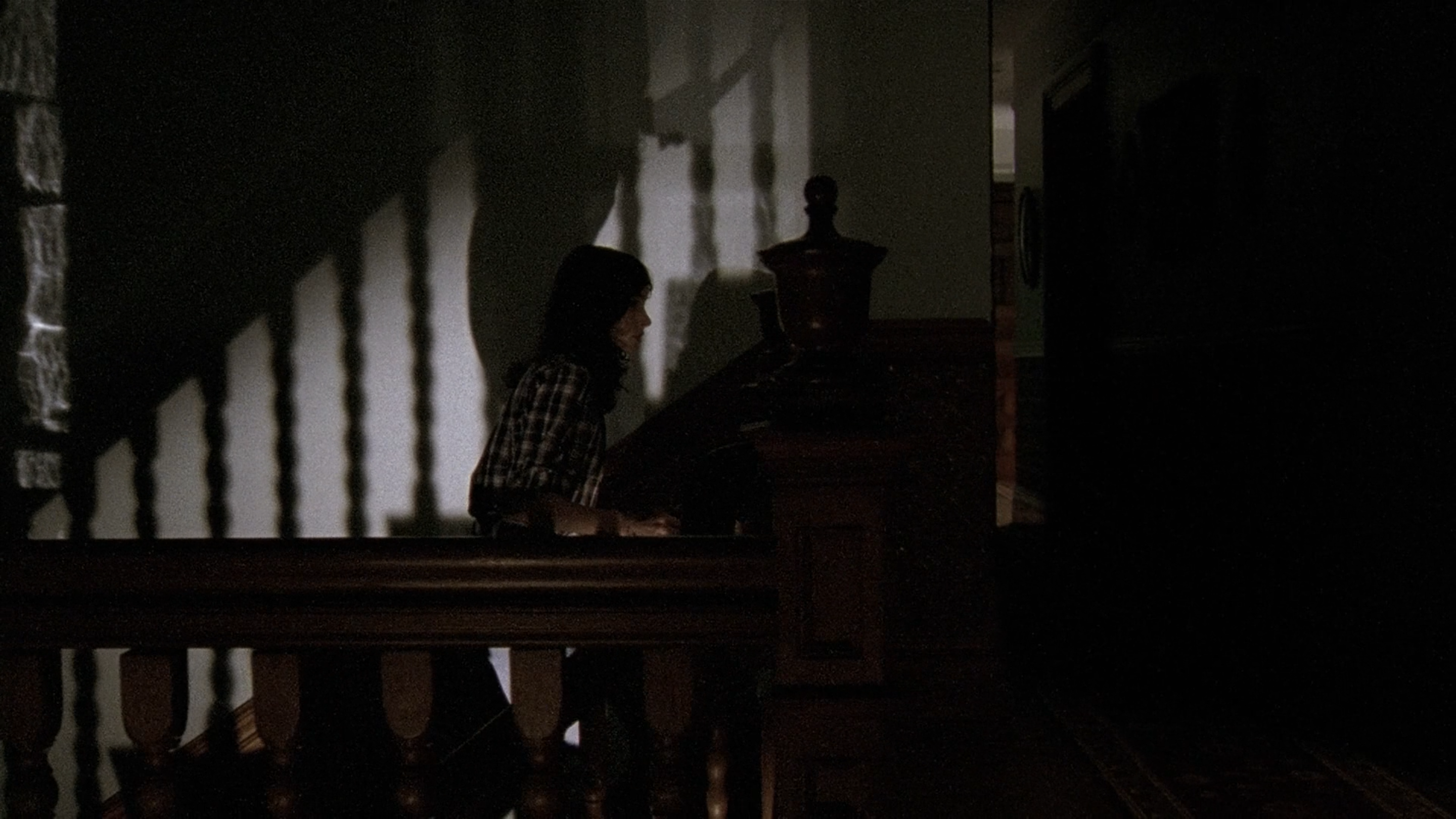
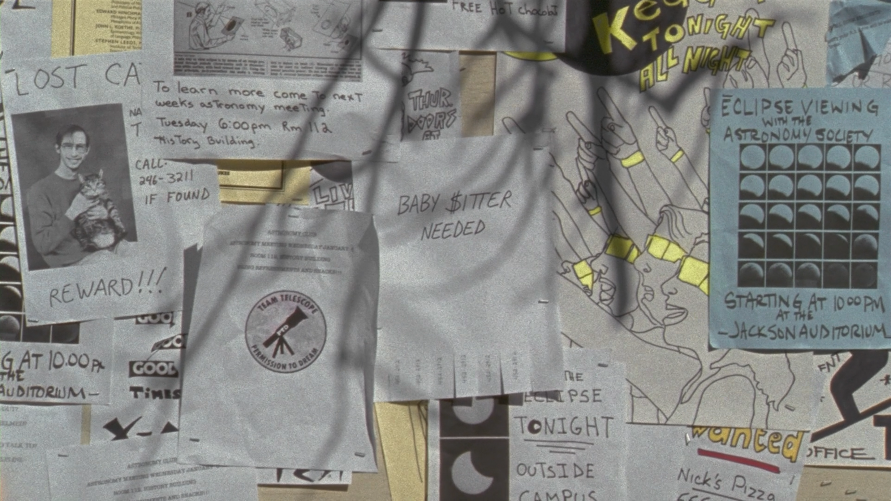
If you are a fan of 1970s/1980s slow burn horror, low on gore, high on psychological suspense, this indie might be a retro genre flick that delivers a solid, funky nostalgia booster shot. The opening delivers perfect graininess consistent with the period as it was shot (almost) entirely on 16mm film stock. Even the title sequence brings back the goofy freeze-frame shots and text fonts that make you want to hunt down your old Sony Walkman cassette player and jam out to The Cars, Moving in Stereo (watch the film and you’ll probably understand the reference).

Story-wise, The House of the Devil shares a large number of intentional, but not overtly obvious classic horror flick tropes as nods to previous masters. Astute viewers will likely notice story similarities to Burnt Offerings (1976) as well as choreography reminiscent The Exorcist (1973), Psycho (1960), and The Shining (1980) to name just a few. Director Ti West accomplishes this near spot-on vibe through low-key nods to his contemporaries without ever over-exploiting. *Chef’s kiss*. The same subtleties are delicately applied in production design, art direction, costume and makeup which can cause a first time viewer truly believe they are watching an authentic lost movie filmed circa 1984.
It’s nearly perfect from concept to print. Yet there are a few unfortunate misses that, in my opinion can be fixed for the ultimate re-release. Call this a fan recommended Director’s Cut if you will.
First, the opening song is obviously a riff on Moving In Stereo by the Cars. In fact, on my first viewing, I actually muted the film as the protagonist, Samantha (played by the highly talented Jocelin Donahue) walks through the title sequence. At the same time, I cued up The Cars and beat-for-beat, everything was just … perfect.

Secondly, you’ll note earlier that I said this was shot (almost) entirely on 16mm film. There is at least one short scene where all film grain disappeared and modern (likely digital) video was utilized. I expect it may have a bit to do with low light in the scene that may have caused difficulty with exposures on film. The grain can be added digitally to match the rest of the film. Additionally, this scene gave away a bit too much of the story and could be cut, or dramatically shortened to deliver a touch more mystery and suspense.
The same story giveaway occurs minutes before in another scene where a supporting villain shows all his cards to the audience far too early in the film. Again, a little creative editing could remove his face, and speaking parts so we can be left with a greater sense of fear and even more mystery.
In fact, this same villain is easily the weakest part in the movie where he comes across more as a stand-in for test shots instead of commanding his supporting role. His poor performance nearly kills the suspension of disbelief on numerous levels. Sorry dude. You kinda sucked.
There’s even a couple of scenes with the main antagonist played by the wonderfully creepy Tom Noonan that could use some editing polish. Regardless, he gave us hella classic Noonan-ness.
And finally, I’ll end on a slight technicality from my point of view. It’s the frame rate, or frames-per-second. Studio films from the 70s/80s played at a rate of 24fps. It seemed quite often that this movie played at a higher rate, maybe 30+fps which distracted me occasionally from what could have been an otherwise aesthetically pleasing, correct vibe.
To be certain, The House of the Devil is masterfully orchestrated and is deserving of 4/5 stars in its current release. If most of the fan-edits ever occur, that elusive 5th star is well within reach.
Related
studiomarkallen


